Many mobile browsers do not support absolute positioning of controls on the form. Instead they render the controls in the order that they were created in the ASP.NET page, in a flow layout arrangement. Depending on the screen size of the mobile device, controls might sometimes be positioned next to each other if they fit on the same line, or beneath one another if they are too wide.
This introduces some problems when defining a form in the AB Suite Painter for use on such a mobile device:
You cannot rely on positioning a control on the form and expect that it displays in the same location on the mobile device.
When generating the ASP.NET Web Form from the definition in the Painter, the controls might not be created in a logical top-left, bottom-right order. Typically, the controls are generated in the ASP.NET page in the order that they were defined in the Painter, and since the Painter allows you to place controls on the form in any order, the generated ASP.NET page does not display the controls in the required order on the mobile device (for example, a top level heading that was added some time after the other controls on the form, displays at the bottom of the page on the mobile device.
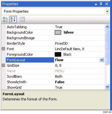
ITo address such layout issues, the Form in the AB Suite Painter has a new property called "FormLayout", which provides two options:
Grid – The ASP.NET Generator generates the controls on the forms as before, and assume an absolute positioning behaviour for the controls on the form. This is the default and should be used for browsers that are capable of absolute positioning.
Flow – The ASP.NET Generator sorts the controls on the form in a top-left, bottomright arrangement, so that they are created in a logical flow layout on the generated ASP.NET page. This ensures that controls are presented on the mobile device in a similar layout as defined in the Painter.
When using the "FormLayout – flow" option to define forms for a mobile screen, the controls should typically be positioned underneath each other in a vertical arrangement. This defines the order that the controls should be displayed on the mobile screen.
Since mobile screen sizes vary, you find that the same form could be rendered differently on different devices. Typically, browsers position subsequent controls on the same line until there is no more screen space, and then place more controls underneath them. You can influence this behaviour by adding labels on the form to include a break tag <br> after a specific control. This has the effect of placing any subsequent controls underneath the current row, and provides a way to render the forms more consistently on different devices with different screen sizes.
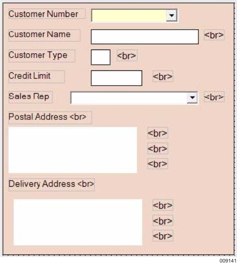
When you wish to display several controls next to each other on the same line, you must ensure that the top edge of each control is in the same vertical location. By enabling the Grid in the Painter (ShowGrid = True), this assists you in positioning the top edges for these controls at the same vertical location. After the last control in the row, a break <br> tag can be added as a label on the form to place any subsequent controls on the next line.
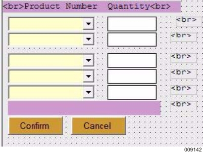
Note: When adding a label for the <br> tag, this label must also have it's top edge aligned with the other controls on the same line, so that it is placed in the correct sequence in the generated ASP.NET form. Alternatively, a <br> tag can be included at the start or end of another label, instead of having a separate label for the tag.
Some of the later browsers are capable of placing controls on the form according to their absolute coordinates. These browsers also attempt to render a web page in the same way as desktop browser. For example, Internet Explorer Mobile 6.1.4 is essentially an implementation of Internet Explorer 6, which runs on a mobile device. When using browsers that have this level of support, the absolute coordinates take effect and position the controls as they were defined in the Painter.