The WPF Client Container displays the designed Views based on the DataViewModels generated by System Modeler when the Access Layer components are built for the WPF/XAML Client technology. The Views can be designed using the WPF Designer (or Blend) and deployed for use by the AB Suite WPF Client application, which is a WPF Container solution provided by Unisys. The designed Views are compiled into a Views assembly that is loaded by the WPF Client at runtime. When a response is received from the host application for an ispec, the corresponding user interface is displayed in the Content Control of the WPF Client Container.
The following figure shows a sample WPF Client Container:
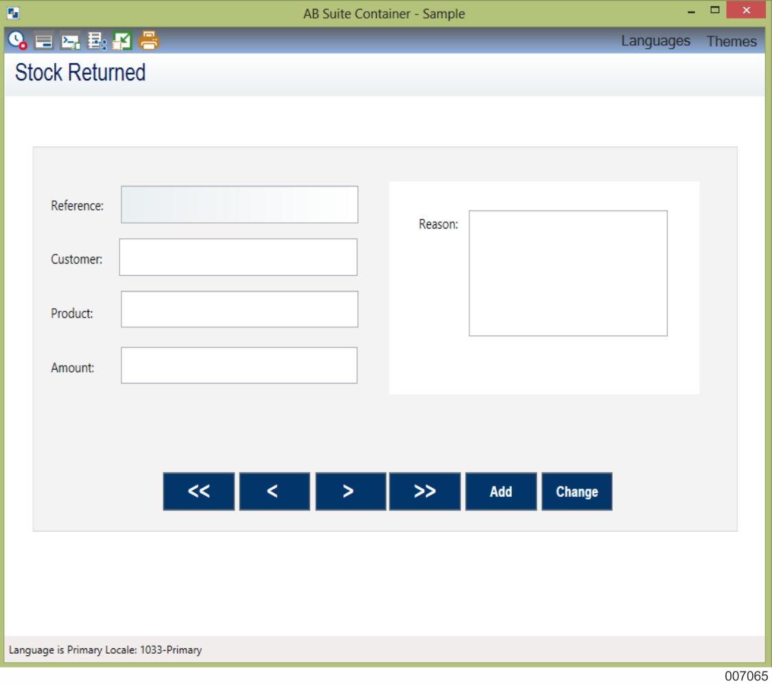
The WPF Client Container comprises a title bar, a tool bar, and a status bar.
Title Bar
The title bar of the WPF Client Container displays
The WPF Client icon.
The WPF Client Container name.
This name can be localized in the string resources of the WPF Client application.
The name of the sample WPF Client Container shown in the above figure is AB Suite Container.
The runtime system name.
This is the system name that is specified in the <TechnologyFolderName>_Config.rtxml file. The name of runtime system in the above image is TestListSeg.
Toolbar
The toolbar displays various icons and menus that you can use to perform operations, such as opening or closing a session, running a report, and selecting a theme.
The icons present on the WPF Client Container tool bar along with their respective description are listed in the following table:
|
Icon |
Name |
Description |
|---|---|---|
 | Open Session | Displays this icon when the WPF Client is connected to the runtime. This allows you to close the session. |
 | Close Session | Displays this icon when you close the session. This allows you to open a new session for one of the systems configured in the config.rtxml file. When you open a session the Selection dialog box appears listing all the configured systems that are available. To initiate the connection with the host application, select a system from the Selection dialog box, and then click OK. Note: When the WPF Client is not connected to a host system, all other Toolbar icons are hidden. |
 | Select a Screen | Allows you to display a specific screen in the WPF Client Container. When you click this icon, a Selection dialog box appears listing the screens that you can display. The Selection dialog box contains two tabs
|
 | Show Console | Displays the Console window. The Console window contains two tabs
Note: If you do not want to provide access to the console window you can choose not to display the Show Console icon by setting the DisableConsole tag to True in the <TechnologyFolderName>_Config.rtxml file. |
 | Run Report | Displays the Selection dialog box with a list of reports that you can execute at runtime. This dialog box also allows you to
To run a report, select a report from the Selection dialog box, and then click OK. The report output appears in the Console window. Note: The list of reports is currently extracted from the report entries configured in the <TechnologyFolderName>_Config.rtxml. |
 | Print Screen | Allows the user to print the screen in the current WPF Client Container window. |
 | Snap to Designed Size | Allows you to change the screen size back to the dimension of the originally designed View. The ContentControl that displays the View inside the WPF Client Container is contained within a ViewBox control. This allows you to resize the WPF Client Container window. When the WPF Client Container window is resized, all controls inside the ViewBox are automatically scaled so they appear larger or smaller, depending on the new dimensions of the window. Note: If you resize the WPF Client Container window to a certain dimension, and then close and reopen the window, it appears with the resized dimension. |
The menus present on the WPF Client Container tool bar along with their respective are listed in the following table:
|
Menu |
Name |
Description |
|---|---|---|
 | Language | Allows you to select a language that has been implemented for an AB Suite Client Framework application. When you select a specific language, a request is sent to the runtime to switch to the specified language. The WPF Client application also switches to use resources specific to that language based on the locale of the specified language. The Language menu displaying the languages are created dynamically to show the languages included in the application. Note: If you have configured only one language for the application, then the Language menu does not appear on the toolbar. |
 | Themes | Allows you to select a theme for the WPF Client. Selecting a theme loads the stylesheet associated with the theme. This formats the control types and other attributes in the screen as specified in the stylesheet. The WPF Client includes built-in themes for Dark and Light color combinations, which you can apply when running the application. When developing the Views for the WPF Client or when converting the AB Suite model to the AB Suite User Experience mode model, you must customize the themes to suit your requirement or create new themes. To customize the Dark or Light themes, you must manually update the Theme_Dark.xaml or Theme_Light.xaml file. For example, if you want to apply the Light theme to the text box graphic control, perform the following:
<!- - Style for TextBox Controls- - >
<Style x:Key = “TextBox_Style_01”
Target Type = “{x:Type TextBox}”
BasedOn = “
{StaticResource BaseTextBox }”>
<Setter Property = “Background”
Value=”Blue” />
The textbox color changes to blue when you build the model and select the Light theme from the Themes menu. |
Note: You need not customize the themes in the Sample User Experience mode model as the selected theme loads the stylesheet associated with it and formats the graphic controls in the View as specified in the stylesheet. The Themes menu displaying the themes are created dynamically to show the themes included in the Resources dictionary. Note: If you have included only one theme in the Resources dictionary, the Themes menu is not displayed on the toolbar. |
Status Bar
The status bar displays status text and error messages sent by the host application. If the host application sends multiple error messages, the status bar displays the message “Multiple Errors Received…”, and an Expand icon appears on the status bar. This icon allows you to expand the status bar upwards and view the error messages. However, if the host application sends a single error message, the Expand icon does not appear.
Note: The status bar also displays unsolicited messages.